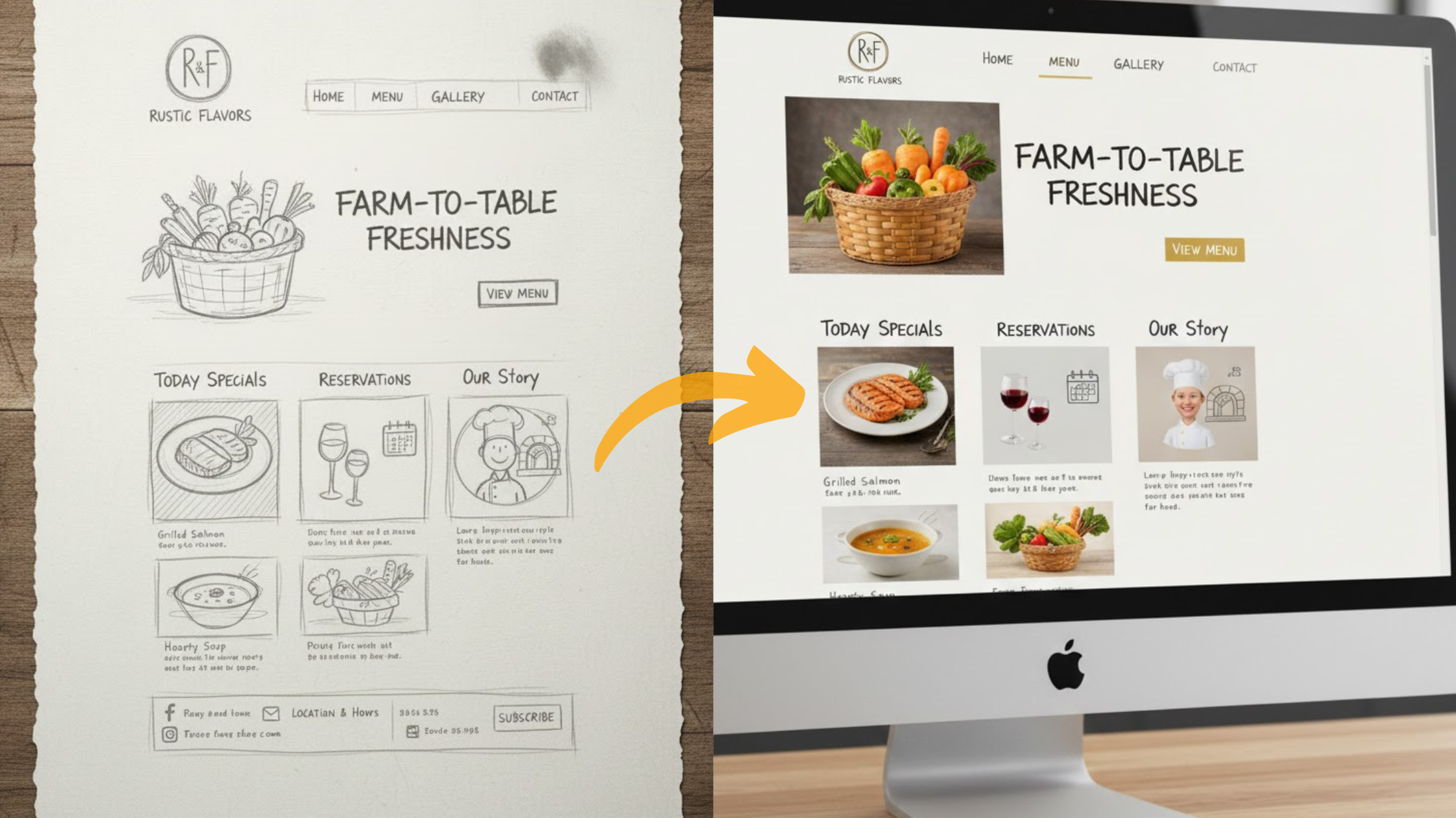
A restaurant website is like having a visual taste of what you offer before getting the actual bite.
When building a restaurant website, you cannot afford to sell the wrong vibe to your audience by choosing a mismatched color scheme and fonts.
While picking colours may seem fun and easy, it can become complicated when choosing the best colour schemes and fonts for restaurants that align with what you offer.
Getting it right is what turns a casual browser into your next booked reservation.
In this guide, we’ll walk you through how to choose the perfect color schemes and fonts to ensure you are selling the right vibe to customers.
Why do Color Schemes Matter?
A restaurant website gives visitors their first impression of your physical restaurant before they visit the location.
Hence, the color schemes and fonts give away your restaurant’s vibe at first sight.
Also, color triggers emotions and influences mood and perception.
For example, rich burgundy can evoke feelings of luxury and sophistication, making it perfect for a steakhouse or wine bar.
On the other hand, fresh, zesty lime green feels healthy and energetic, making it an ideal choice for a juice bar or vegan café.
The right color palette doesn’t just make your site look good; it tells your story and prepares customers for the experience they’re about to have.
Why Do Fonts Matter?
Website font carries personality.
Think of it this way: just as you wouldn’t use Comic Sans for a legal document, you shouldn’t use a mismatched font for your restaurant website.
For example, a sleek, modern sans-serif font suggests clean, contemporary, and innovative, while a traditional serif font conveys classic, established, and trustworthy.
One thing you should not go wrong with when choosing a font for your restaurant’s website is readability.
A beautiful but unreadable script font for your menu descriptions will frustrate guests and drive them away.
Therefore, your typography must strike a balance between personality and clear communication.
Best Color Schemes and Fonts for Restaurant Websites
There’s no single best combination, but there are winning combos for color schemes and fonts for restaurant websites. Examples:
Fine Dining and Elegant Bistro
If you want a website for a fine dining and elegant bistro restaurant, you can aim for neutral and sophisticated or a dark and moody vibe.
Consider these color palettes: charcoal gray, deep navy, or black paired with cream, gold, or muted bronze to create a sense of luxury and intimacy.
For this type of restaurant, you can have serif fonts. For example, consider Playfair Display, Cormorant, or Mrs. Eaves for a timeless, authoritative, and elegant feel.
Use a highly readable sans-serif font, such as Lato or Open Sans, in a lightweight style to provide a clean, modern contrast that is easy on the eyes for the body text.
Fresh and Healthy Cafe
A restaurant website for a fresh and healthy cafe should communicate cleanliness, vitality, and a connection to natural, good ingredients.
This is where nature’s palette shines.
For this website, combine whites and light woods with accents of sage green, soft aqua, or sunflower yellow.
The white shows cleanliness and purity, while the greens and earth tones evoke freshness, health, and organic quality.
Remember, the color combo should feel inviting, uplifting, and trigger thoughts of farm-to-table ingredients.
Clean, friendly sans-serif fonts work perfectly. Options like Poppins, Montserrat, or Raleway feel modern, approachable, and airy.
You can also introduce a gentle, rounded sans-serif like Nunito or Quicksand to enhance the friendly and wholesome vibe.
Family-friendly and Casual Eatspot
For a family-friendly and casual eatspo restaurant website, portraying energy is key.
Try out bright, warm colors like tomato red, mustard yellow, and sky blue. These are classic colors that stimulate the appetite and a sense of fun.
To keep the bright and playful colors from feeling overwhelming, anchor them with plenty of white or light gray. This creates a balanced, cheerful, and welcoming environment that appeals to all ages.
For the website’s fonts, go for bold, readable, and playful fonts. A sturdy, friendly sans-serif like Fredoka One or Barlow can be great for headlines.
The menu requires clarity. A simple, bold sans-serif font, such as Roboto or Source Sans Pro, ensures that everyone can read it easily.
Rustic and Artistic Restaurant
The color scheme and font for a rustic and artistic restaurant website should feel warm and earthy.
Hence, use deep burgundies, olive greens, and warm browns against a backdrop of cream or off-white. The palette should feel handcrafted, authentic, and grounded, suggesting a connection to tradition, local sourcing, and comfort food.
You can try out a handwritten or script font used sparingly for the logo or headlines. Then pair it with a slab serif font, such as Roboto Slab or Josefin Slab.
Slab serifs have a sturdy, geometric feel that perfectly complements typewriter text, aligning with the rustic, artisanal aesthetic.
Simplified Color Schemes and Fonts for Restaurant Websites
| Resturant | Goal | Color schemes | Fonts |
| Fine dining and elegant Bistro | Luxury, intimacy, and sophistication. | Main Colors: Charcoal Gray, Deep Navy, BlackAccent Colors: Cream, Gold, Muted Bronze | Headlines: Serif Fonts (Playfair Display, Cormorant, Mrs Eaves)Body Text: Lightweight Sans-Serif (Lato, Open Sans) |
| Fresh and Healthy cafe | Cleanliness, vitality, and natural ingredients. | Main Colors: White, Light Wood TonesAccent Colors: Sage Green, Soft Aqua, Sunflower Yellow | Main Fonts: Clean Sans-Serif (Poppins, Montserrat, Raleway)Friendly Accent: Rounded Sans-Serif (Nunito, Quicksand) |
| Family-friendly and casual spot | Energy, fun, and appetite appeal to all ages. | Main Colors: White, Light GrayAccent Colors: Tomato Red, Mustard Yellow, Sky Blue | Headlines: Bold & Playful Sans-Serif (Fredoka One, Barlow)Body/Menu: Simple & Readable Sans-Serif (Roboto, Source Sans Pro) |
| Rustic and artistic spot | Warmth, authenticity, and handcrafted comfort. | Main Colors: Cream, Off-WhiteAccent Colors: Deep Burgundy, Olive Green, Warm Brown | Headlines/Logo: Handwritten or Script Font (used sparingly)Body Text: Slab Serif (Roboto Slab, Josefin Slab) |
Factors to Consider When Choosing Color Schemes and Fonts
Have these factors in consideration when choosing the color schemes and fonts for your restaurant website:
Cuisine and Concept
This is a crucial factor to consider. Your design must be an extension of your food. For example, an Italian trattoria website should have a distinct feel from a sushi bar.
Hence, allow the origins and style of your cuisine to guide your color and font choices.
Target Audience
Every website should prioritize the target audience when making decisions. Restaurant websites are no exception.
So, who are you trying to attract?
For instance, a trendy cocktail bar targeting a young, hip crowd can use edgier fonts and darker, more dramatic colours.
On the other hand, a family pizza parlour requires a brighter and more cheerful design.
It is essential to understand your customers and design a restaurant website tailored to their needs.
Brand Alignment
Your website shouldn’t be an island. The colours and fonts you choose here must work in harmony with your physical menu, social media graphics, and interior decor.
A consistent brand experience builds trust and makes your restaurant more memorable and easy to recognize.
Readability is Paramount
No matter how beautiful a font is, if people can’t read your menu or your contact information, you’ve lost a customer.
Therefore, prioritize clarity, especially when dealing with large blocks of text. Additionally, ensure there is sufficient contrast between your text colour and background colour.
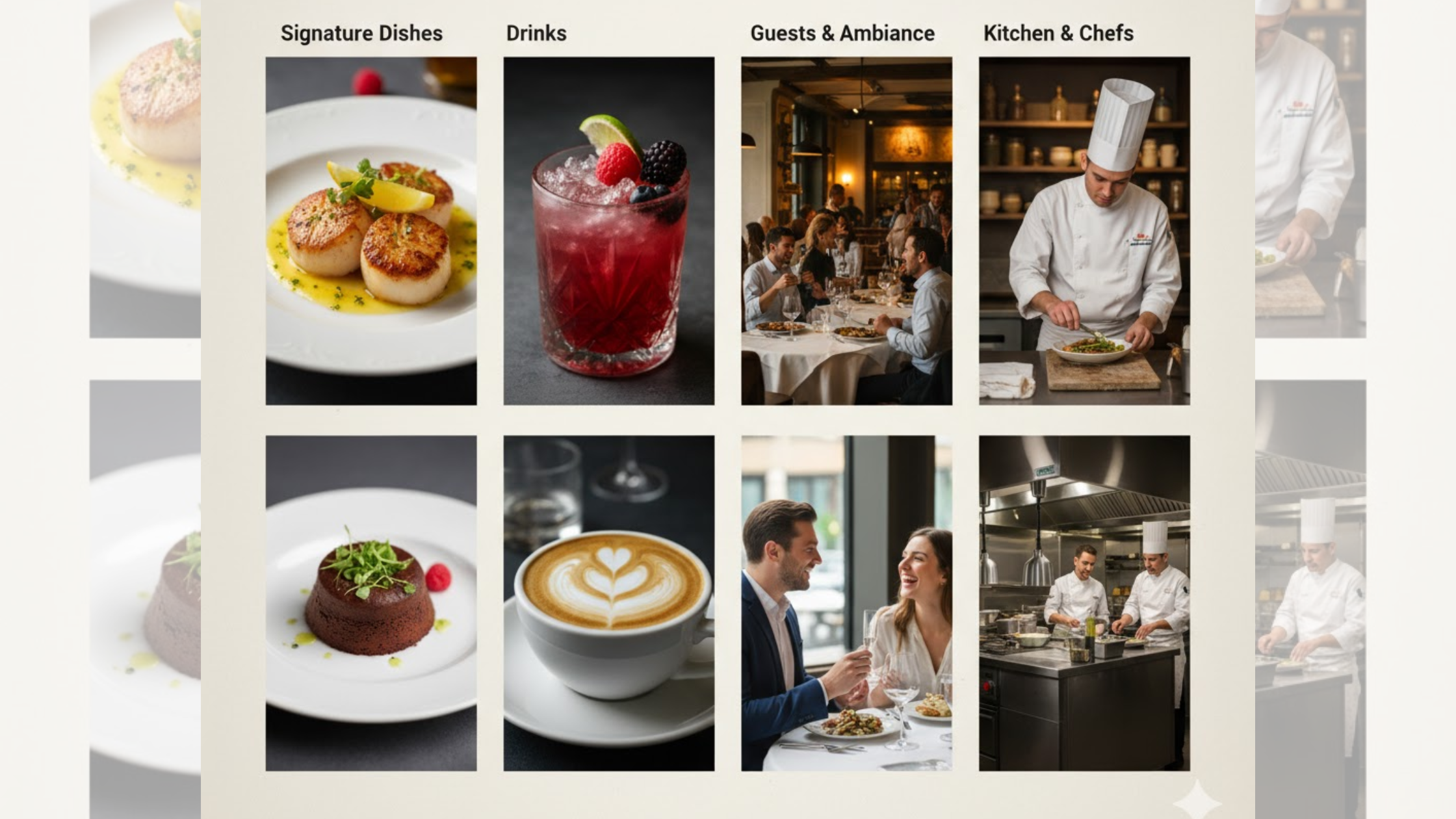
Photography
Your food photos are the star of the show and what sells you to customers. Your color scheme should act as a frame that makes those photos pop, not compete with them.
Hence, a neutral background makes vibrant, colorful food look even more delicious.
Tips for Picking the Perfect Color Scheme and Font
Match Your Vibe
Your website is an extension of your restaurant. Consistency is important:
- Fine dining? Use elegant colors.
- A casual spot? Use bright, fun ones.
Enhance Clarity
No matter how visually appealing some fonts are, never sacrifice readability. Choose easy-to-read fonts, especially for your menu and contact info.
Stick to Two Fonts
Use one font for headlines and a different, simple font for all other text to avoid overwhelming the website with too many fonts. Two fonts can help achieve a clean and professional look.
Let your Food Star
Use neutral background colors to make your food photos stand out. The food is an important part of selling to customers.
Design for Phones
Check that your site looks good and is easy to read on a mobile screen. Most website traffic comes from mobile devices, making it essential to have color schemes and fonts that display well on a phone.
Choose Appetizing Colors
- Reds and Yellows: Energizing (great for burgers, pizza).
- Greens and Browns: Natural and fresh for cafes.
Conclusion
Your restaurant website welcomes customers before they come in physically. The colors and fonts you choose are the first things guests see, setting the mood before a single bite is ordered.
By selecting the right palette and typography, you’re giving customers a genuine sense of what to expect. You’re telling them what your restaurant offers before they even look at the menu.
So, think about the unique story your restaurant tells. Let that story guide your choices. When your website perfectly matches your restaurant’s vibe, you don’t just attract customers, you get the right audience, who are already excited for the experience you’ve promised.