
When a customer pulls out their phone and finds your restaurant, but your website is slow to load, the menu is blurry and difficult to read, or the “Order” button is too small to tap, in that moment, you’ve lost a customer.
Today, most people search for food on their phones. If your website isn’t built for them, you’re missing out.
This is why having a mobile-first restaurant website is no longer a bonus; it’s a necessity.
A mobile-first restaurant website is designed for the small screen from the very beginning. It prioritizes speed, simple menus, and easy tapping.
It’s all about creating a smooth, frustration-free experience that turns a hungry scroller into a happy customer.
Read on to see why this approach matters and how you can easily achieve a mobile-first restaurant website.
What Is a Mobile-first Restaurant Website?
Simply put, a mobile-first website is created for phones first, before it’s adapted for larger screens, such as desktop computers.
Instead of taking a big, desktop site and trying to shrink it down, website designers and builders start with the mobile experience.
A mobile-first restaurant website prioritizes what a phone user needs most: fast loading times, easy-to-tap buttons, and a simple layout that makes finding information easy.
Olitt AI restaurant website builder can create a smooth, frustration-free experience for the vast majority of your visitors who are on the go.
Why You Need a Restaurant Website
While having social media accounts and a listing on a food delivery app are all great strategies to attract customers to your restaurant, they are not enough.
You need a restaurant website to take charge of your brand.
It’s a Reliable Source of Information
A restaurant website is a reliable place to update information on:
- Menus
- Events
- Offers
- Discounts
It is where new and recurring customers come to verify information about your restaurant from other platforms, like social media.
Gets Direct Orders
While third-party apps are great, they can charge high commissions for orders.
Having your own website can integrate direct online ordering, putting more profit back in your pocket.
Additionally, it is a trustworthy platform where customers feel more comfortable placing orders, as it is your own without third-party interference.
Helps Build Your Brand
With a restaurant website, you can show off your restaurant’s unique atmosphere, share your story, and connect with customers on a deeper level than a simple app profile ever could.
Why Mobile Optimization Matters for Hungry Customers
Mobile optimization is a crucial feature for every restaurant website.
A hungry customer makes a quick decision, and your website needs to help them, not hinder them.
Here’s why your restaurant website needs mobile optimization:
The Right Now Factor
Customers searching for food on their phones are mostly ready to eat now. They could be looking for:
- Your address
- Your hours
- To place a takeout order.
A mobile-optimized site lets them do this in seconds without hassle.
The Google Connection
Google prioritizes displaying mobile-friendly websites in its search results. If your site isn’t optimized, it will rank lower, making it harder for new customers to find you.
In other words, you can lose potential customers by not having a mobile-optimized website.
Ease is Everything
A messy, unoptimized site where text is too small, buttons are difficult to tap, or the menu is a slow-to-load PDF creates friction when customers interact with your business online.
That friction can easily lead a potential customer to click over to your competitor.
Important Features of a Mobile-First Restaurant Website
When a customer visits your site on their mobile device, they should be able to find what they need quickly.
Your website’s job is to help them do that without any fuss. Here are the non-negotiable features for a great mobile experience:
Sticky Header with a Simple Menu
The top of your screen should always be visible as the user scrolls.
It should have a clear, easy-to-tap hamburger menu (the three-line icon) that expands to display simple options, such as
- Menu
- Hours
- About
- Contact
One-Tap Action Buttons
A mobile-optimized restaurant website should feature large, colorful buttons for key actions that are visible on the homepage. For example:
- Order Online
- View Menu
- Call Us
- Get Directions
These should be easy to locate and press with a thumb.
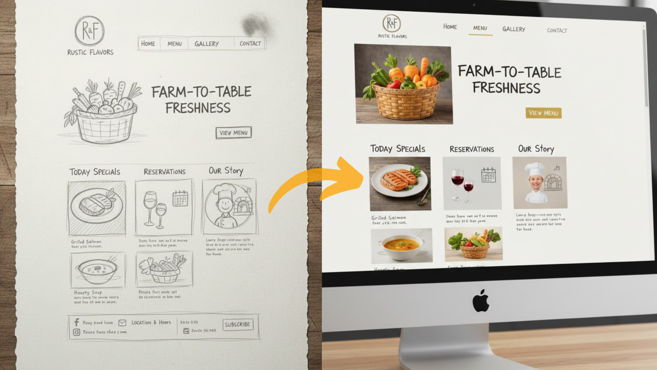
Text-Based, Search-Friendly Menu
Avoid using a PDF file for your menu. It’s slow to load and hard to read on a small screen.
Instead, have a simple text menu on a webpage.
This loads instantly, is easy for Google to understand, helping you show up in searches, and allows customers to scroll through it smoothly.
Integrated Maps and Click-to-Call
Your address shouldn’t just be text. It should be a link that instantly opens Google Maps or Apple Maps for turn-by-turn directions.
Similarly, your phone number should be click-to-call, allowing a call to be initiated with a single tap.
Online Ordering Integration
Getting online orders is a good measure of conversion for a restaurant website. It shows that your content is winning.
Ensure that online order integrations are seamless, allowing customers to order instantly when they want to.
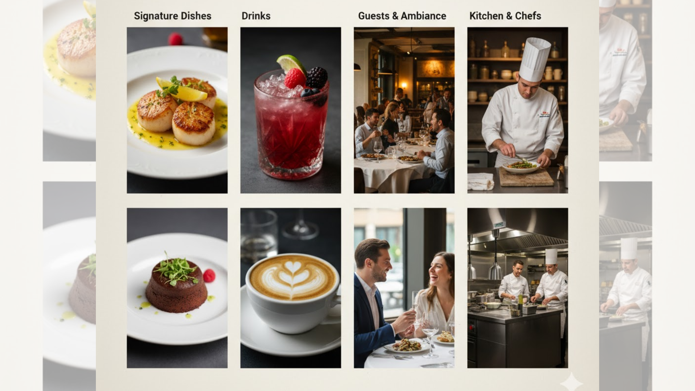
Optimized Food Galleries
The restaurant website should perfectly show off your delicious dishes. In addition, the images must be optimized to load quickly without consuming excessive data.
A simple grid of high-quality, mouth-watering photos can be the final nudge a customer needs to visit.
How to Optimize a Restaurant Website for Mobile
Achieving a mobile-first website can seem like a daunting task, but with these tips, you can create a hassle-free, mobile-optimized site for your restaurant.

Prioritize Lightning-Fast Speed
A slow website will lose you hungry customers in seconds. Aim for your site to load in under three seconds to keep potential diners engaged.
To achieve this, compress your food images to ensure they look great without slowing down the process.
Additionally, select a website platform that utilizes clean code and caching to ensure optimal performance across all connections.
Implement a Mobile-Friendly Menu
Ditch the PDF menu, which forces users to zoom and scroll awkwardly.
This format is frustrating on mobile devices and invisible to Google, which can hurt your search rankings.
Instead, build your menu directly onto a webpage using simple text. This enables instant loading, easy scrolling, and improved SEO.
Also, use clear headings and collapsible sections to keep it tidy and easy to navigate.
Design for Thumb-Friendly Use
Remember, phone users navigate with their fingers, not a precise mouse cursor. Your buttons and links must be easy to tap accurately.
Ensure all interactive elements, especially your “Order Online” and “Call Now” buttons, are large enough and have plenty of space around them to prevent mis-taps and user frustration, making ordering smooth and simple.
Enable One-Tap Actions
Remove any friction for customers ready to take action.
First, your contact information shouldn’t just be static text; it should be interactive.
Code your phone number as a “click-to-call” link and your address to open directly in Google or Apple Maps.
This transforms basic information into one-tap commands that start a phone call or provide instant directions.
Have a Clean, Simple Layout
A cluttered screen can be overwhelming on a small device. Good mobile design is about clarity and prioritization.
Hence, use a single-column layout that is easy to scroll and avoid intrusive pop-ups that block content.
In addition, lead with your most important information, your menu, and action buttons, and use ample white space to create a clean and effortless experience.
Understand Customer Feedback
Optimizing your restaurant website is a continuous process. You will make improvements as you grow and develop.
Invite feedback about the customer experience when using the website and note areas for improvement or updates.
This way, you can resolve complaints and make your restaurant website mobile-optimized with real-world experience and feedback.
Every Website Restaurant Should Have This
If you are building a restaurant website, make sure these elements are easy to find on the mobile view:
- Clear, Tappable Phone Number
- Up-to-Date Hours of Operation
- An Easy-to-Read Online Menu
- Your Address with a Maps Link
- A Simple Online Ordering System or a link to your delivery partners
- A Link to Make Reservations if you take them
How Olitt AI Makes Mobile-First Restaurant Websites Easy
Olitt is built with the understanding that most visitors will be on their phones, so it creates mobile-friendly sites by default.

Here’s how Olitt ensures your restaurant’s site works perfectly on phones and tablets:
Flexible, Responsive Templates
The building blocks of your site automatically resize and rearrange themselves to fit any screen, from a large desktop monitor to a small smartphone.
With Olitt AI, you don’t have to design two separate sites.
Get Smart, Fast-Loading Images
Olitt automatically adjusts and scales your food photos to load quickly on mobile devices without sacrificing quality.
This means your beautiful dishes appear fast, even on slower mobile connections.
Olitt Delivers Touch-Friendly Features
Key elements, such as navigation menus, buttons, and forms, are designed for fingers, not mouse cursors.
Olitt website builder delivers large, tappable buttons and the familiar hamburger menu that mobile users expect.
Faster Page Speeds
Olitt utilizes techniques such as lazy loading (loading images only as they are scrolled into view) and file optimization (compressing code to reduce its size) to ensure your site is snappy and responsive.
Readable Text on Any Screen
The text on your site automatically adjusts in size and spacing so it’s always easy to read without having to pinch and zoom.
See Changes as You Make Them
Oilitt features a built-in editor that lets you see a live preview of how your page looks on a mobile phone, so you can make adjustments and get it just right.
Built-in SEO & Best Practices

Olitt handles the technical foundations, such as proper image descriptions and mobile-friendly code, which helps your site rank better on Google and provides a seamless experience for all visitors.
Conclusion
When customers are hungry, they grab their phone. Your website is their first look at your restaurant. If it’s slow or hard to use, they’ll simply choose another place to eat.
A great mobile website does three simple things:
- Loads in seconds.
- Makes your menu easy to read.
- Let’s customers order or call with one tap.
This isn’t just convenient; it’s essential for competing today. A mobile-friendly site turns hungry searchers into happy customers.
Ready to build a website that works for you?
Forget the technical hassle. With Olitt, you get a mobile-friendly site by default. It’s the easy way to:
- Get a fast, beautiful site.
- Show off your menu perfectly.
- Start taking orders right away.
Don’t lose another customer to a bad website. Build your mobile-first restaurant site with Olitt today.