
A customer visiting your restaurant’s website expects to easily skim through your menu page and find what they need.
It can be frustrating if the page takes too long to load or the menu page appears complicated.
This can result to then leaving within seconds, and you lose a potential sale.
It’s demotivating, right? You’ve spent hours crafting delicious meals, but a poorly designed menu page can drive customers away before they even get a taste.
Studies show that about 70% of mobile users will leave a site if it’s hard to read or slow to load.
This is why a smart restaurant menu page design is so important. A well-structured page helps turn casual visitors into paying customers.
By highlighting your most profitable dishes and creating an easy browsing experience, you can boost your sales by 15–30% without increasing your prices.
This guide will show you how to design a menu page that not only looks good but also sells more.
You’ll learn simple, effective strategies you can apply to any type of restaurant, from cozy cafés to busy chains.
Here’s what you’ll learn:
- How to build a clean, readable menu layout
- Design tricks that help customers make faster decisions
- Ways to use visuals and descriptions to boost appetite
- Technical must-haves for mobile and SEO performance
- Subtle psychology tips that increase average order value
Let’s begin.
Foundational Principles of Restaurant Menu Page Design
Start with the basics. These core principles set the tone for how visitors experience your website.
When done right, they help customers stay longer and engage more deeply.
1) Make It Readable
Your customers should be able to read your menu easily, without zooming in or straining their eyes.

Use clear, screen-friendly fonts such as Arial, Helvetica, or Open Sans.
Keep the body text size between 14 and 18 pixels. Anything smaller makes reading uncomfortable, especially on mobile devices.
Contrast is key. Black or dark gray text on a white or light background improves readability.
According to the Web Content Accessibility Guidelines (WCAG), a contrast ratio of at least 4.5:1 is recommended for legibility.
Avoid fancy script fonts. They might look stylish, but they slow down reading and frustrate users.
And don’t underestimate white space. Proper spacing between menu items allows each dish to stand out and keeps the page from feeling cluttered.
2) Understand Your Audience
Your design should match your target audience.
A fast-casual diner will expect a simple, scrollable layout, while a fine dining restaurant might suit an elegant grid with photos and detailed descriptions.
Think about your customers:
- Families might appreciate sections for kid-friendly meals.
- Health-conscious guests might want labels for gluten-free or plant-based options.
- Local diners may respond well to familiar regional icons, like a chili symbol for spicy foods.
Use analytics tools such as Google Analytics or Hotjar to track where users click most. This data helps you adjust your design based on real customer behavior.
3) Keep It Consistent
Consistency builds trust. Use your restaurant’s brand colors, typography, and tone across the entire site.
If your restaurant has a playful brand, use friendly, casual language. If it’s a luxury steakhouse, a refined and professional tone works best.
When visitors return, a consistent look and feel make your brand instantly recognizable.
Layout and User Experience Optimization
Once the basics are in place, focus on how you organize the page. A clear layout helps customers find what they want faster and encourages them to order more.
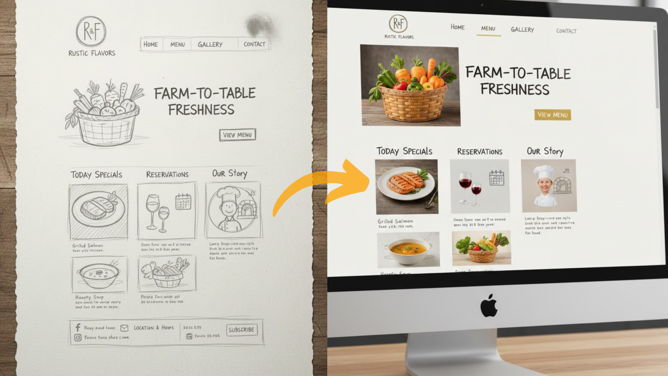
1) Choose the Right Layout
Your layout depends on your menu type.

- Grid layouts work well for photo-heavy menus. They allow you to display dishes like a visual gallery.
- List layouts are ideal if your menu has detailed descriptions or ingredient information.
- Single-page layouts keep things simple and work well for smaller menus.
- Tabbed layouts help organize larger menus, like separating appetizers, mains, and desserts.
Whatever you choose, ensure your design is responsive. it should automatically adjust to look good on all devices, from phones to tablets.
2) Organize Content Logically
Structure your menu the same way people eat. Start with appetizers, then mains, and finish with desserts. This feels natural and easy to follow.
Add filters for dietary needs, such as vegan or gluten-free options, so users can find what suits them.
Highlight important details like allergens. Bold or use icons to make them clear. This helps you avoid confusion and potential customer complaints.
3) Use Clear Hierarchy
Headings and subheadings guide the eye. Use large, bold titles for categories like “Starters” or “Entrees.”
Subheadings or italics can be used for special notes like “Chef’s Recommendations.”
Follow an F-shaped scanning pattern; most users read from top to bottom and left to right.
Place your best-selling or high-margin items in these visual hot spots.
4) Focus on User Experience
Speed matters. Research by Google shows that 53% of mobile users leave a page that takes longer than 3 seconds to load.
Compress images to under 100KB and use fast hosting.
Add clear, clickable buttons for key actions, like “Order Now” or “Reserve a Table.”
Regularly run A/B tests on your menu layout. Compare two designs to see which one performs better in terms of engagement and conversion.
5) Keep the Design Simple
Avoid clutter. Flashing banners or too many animations distract from your food.
Minimalist designs with plenty of space help highlight your dishes.
Take inspiration from brands like Chipotle or Sweetgreen, their clean, photo-driven layouts have helped them increase online orders significantly.
Visual and Descriptive Elements
Photos and descriptions do more than decorate your page—they tell a story and influence buying decisions.

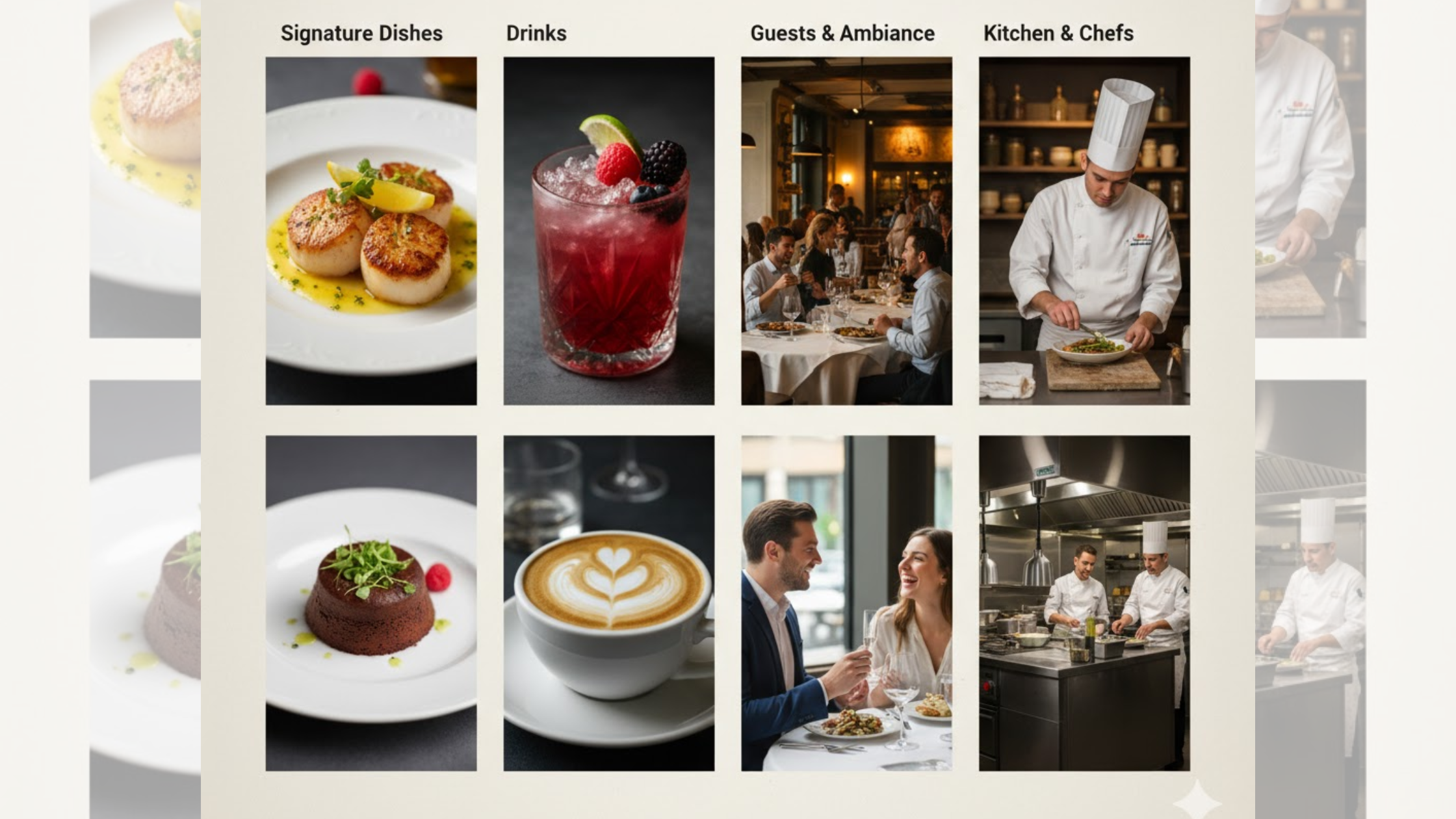
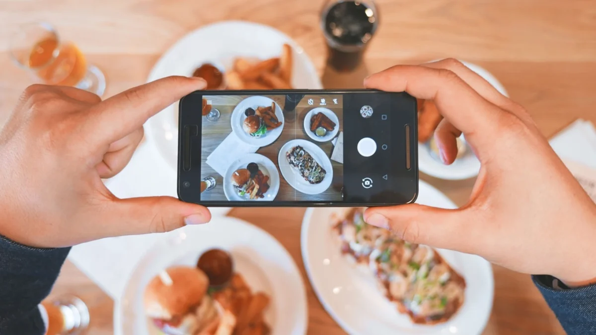
1) Use High-Quality Images
Hire a professional photographer if possible. Natural lighting and close-up shots of textures make dishes look fresh and appetizing.
Add zoom features so mobile users can take a closer look.
Always include alt text for every image. This improves accessibility and boosts your search engine visibility.
Limit each section to 3–5 images to maintain fast load times.
2) Write Mouth-Watering Descriptions
Use sensory language. For example, instead of “Calamari – $12,” say “Crispy calamari, lightly fried and served with a zesty aioli dip.”
Keep descriptions short, between 10 and 20 words, but make every word count.
Words like buttery, smoky, and crisp evoke taste and texture, helping customers imagine the flavor before ordering.
3) Display Prices Effectively
Position prices next to items for quick scanning.
Consider charm pricing. Studies show that prices ending in .99 feel more appealing to buyers.
Removing the dollar sign can shift focus from cost to value.
For add-ons or upgrades, include small notes such as “Add fries for $3.” This encourages upsells without being pushy.
Technical and Accessibility Best Practices
A beautiful design means little if your site doesn’t perform well. Make sure it’s fast, mobile-friendly, and accessible to all users.
1) Prioritize Mobile Users
More than 60% of restaurant searches happen on mobile devices. Design with phones in mind first.
Buttons should be large enough for tapping—at least 44 pixels wide.
Show your best items near the top of the page, so they’re visible without scrolling.
2) Use Familiar Navigation

Stick with recognizable icons and navigation styles.
A fork and knife icon for the menu or a magnifying glass for search makes browsing intuitive.
Add breadcrumb trails like Home > Menu > Pasta so users don’t get lost.
Keep your “Order Online” button visible as users scroll for convenience.
3) Ensure Accessibility
Use semantic HTML so screen readers can interpret your content.
Include alt text on every image and ensure high contrast for users with color blindness.
Enable keyboard navigation so visitors can use the Tab key to browse through items.
Avoid uploading PDF menus. They’re hard to read on phones and aren’t accessible to all users. Use clean HTML instead.
4) Optimize for SEO
Use relevant keywords naturally in your headings and descriptions, like “Italian restaurant menu” or “seafood specials.”
Add schema markup to display menu items, ratings, and prices directly in Google results.
Link your menu page to your Google Business Profile so customers can find it easily when searching locally.
If you have signature dishes, give them their own pages for more search visibility.
5) Use Sticky Menus for Long Pages
If your menu has many sections, use a sticky navigation bar that stays visible while scrolling. This makes it easy for users to jump between categories.
For shorter menus, skip this feature to keep the design simple.
Advanced Strategies and Psychology
Once you’ve mastered the basics, apply small psychological tactics to subtly guide your customers toward higher-value choices.
1) Use Visual Psychology
Studies show that users’ eyes gravitate to the top-right, center, and bottom-left areas of a page.
These are your prime spots for best sellers or profitable items.
Use scarcity and exclusivity. Labels like “Limited Edition” or “Chef’s Special” create urgency.
Add badges like “Popular Choice” or “Customer Favorite.” According to research, social proof influences 80% of buyer decisions.
Keep categories short—no more than seven items per section. Too many options cause decision fatigue.
Use colors strategically. Green suggests freshness, while orange and red can trigger appetite.
2) Keep Complex Menus Simple
Even if your restaurant has many items or multiple locations, the design should stay simple.
Use modular sections so you can easily swap dishes or local specialties.
Integrate your website with your POS system so online orders flow smoothly to the kitchen.
Keep an eye on emerging tech like AR previews, where users can see a 3D model of a dish before ordering. It’s a growing trend among modern restaurants.
Conclusion
Now you have a clear blueprint for designing a restaurant menu page that sells.
Great design isn’t about luck, it’s about strategy. When done well, it captures attention, builds trust, and increases sales.
Here are quick steps to get started:
- Review your menu’s readability and spacing.
- Test your site on mobile devices.
- Highlight high-margin items in prime viewing spots.
- Add descriptive text and alt tags for SEO and accessibility.
- Run A/B tests to discover what works best.
A thoughtful menu design helps customers enjoy browsing and makes them more likely to order.
Take time to polish it, and your restaurant’s website can become one of your strongest sales tools.